Welcome to the first installment of a weekly(ish) segment where I learn some things about a technology and then write some things about it. This week, I spent some time looking at CSS, and I’ll share some tricks and links with you.
CSS, or Cascading Stylesheets, is a language for telling the web browser how to lay out elements on a web page, and what they should look like. This post isn’t intended as an introduction to CSS. If you’re looking for that, Ali Spittel recently wrote a good post about it on the DEV forum. If you’re just looking for information on layout, skip to the Resources section, where there are links to a tutorial on layout, as well as tutorials specifically on Flexbox and Grid.
Starting Off
The fist task I set myself was to just make a nice looking but not very complicated page. The result looked like this:
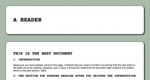
A few techniques that were used on this page are: rounded corners, drop shadows, and small caps text. I’ll give more details on those in the next sections.
Rounded Corners
Rounded corners are accomplished with the border-radius CSS rule. In this case, it was:
border-radius: 20px;
This property can be set for each corner individually. You can see a few elements in Twitter’s UI that use this property:
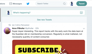
- The media preview in the tweet
- The “What’s happening?” text field where you type tweets
- The rounded left and right sides on the Tweet button
- The circular user icons
If you’re using Firefox you can find out how rounded corners or some other effect is achieved by right-clicking the button or other rounded-cornered element, and clicking “Inspect Element”. (Other browsers have similar capabilities.) If you do that for a user icon in Twitter, you’ll see something like the following:
.avatar {
    width: 48px;
    height: 48px;
    border-radius: 50%;
}
Note that sometimes percent is used and sometimes px. A border-radius of 50% makes the element circular.
This MDN page has more info on border-radius.
Drop Shadows
Drop shadows are made using something like:
filter: drop-shadow(3px 3px 3px black);
I’m not sure why it’s a “filter”, but here are the MDN pages for the filter property and the drop-shadow filter value. There’s also a property called box-shadow, which might just be the same thing without having to use it as a filter.
Small Caps and Uppercase
A couple things you can do with text using CSS are to uppercase it, using the text-transform property:
h1, h2 {
    font-family: monospace;
    text-transform: uppercase;
}
…or to make it into small caps using the font-variant property:
a {
    text-decoration: none;
    font-variant: small-caps;
}
There’s a tutorial on text styling linked from the Resources section.
Layout
CSS is good for styling, but what about layout? CSS has a couple relatively new features called Flexbox and Grid, which might finally allow it to catch up with the ease of use of using HTML tables for layout. Tables are supposed to be bad for accessibility reasons, because screen readers interpret them as “tabular data” (i.e. the stuff you’d put in a spreadsheet), and so you shouldn’t use them for layout (I *guess*). This could have been solved easily if the HTML standard had added a single property telling screen readers to just treat it as a layout table instead of a data table. Something like:
<table semantic="false">
  <!-- and so forth -->
</table>

<!-- the semantic="false" property
     doesn't actually work because
     they don't want you to be happy -->
But I digress. Flexbox and Grid exist now. I didn’t delve into them this week. Which is probably why things got so frustrating after I started focusing on layout without them.
One thing I spent a lot of time trying to replicate was Facebook’s layout, which has a navbar on the top and another one on the side that stay in place as you scroll.
The top navbar that stays in place is accomplished using position: fixed.
header {
    position: fixed;

    /* position: fixed has
       to be used with one of:
       top, bottom, left, right */
    top: 0;

    width: 100%;
    margin: 0;
    padding: 1rem;
    height: 1rem;
}
But this will obscure some content. So the solution is to make a div that’s the same size, *without* position: fixed, to go above the content.
.fakeHeader {
    height: 1rem;
    margin-top: 0;
    padding: 1rem;
}
Adding a sidebar was more difficult, and I never got it right without it screwing up the content area in some way or another. there are recipes for adding sidebars (one of which is linked in the Resources section), but they tend to assume the lack of a top navbar. Whenever I got the sidebar looking right, the content area would always get messed up in some way. I’m guessing the solution would be to just use Flexbox to define the horizontal areas of the hidden fake topnav and the area below it, and then use another Flexbox to partition the area below the topnav into sidebar and content areas.
Resources and Further Reading
Here are some links that I came across in my studies.
- Layout tutorial at w3schools that I wish I had found earlier. Incidentally, I found it by googling “html table layout”. QED.
- Flexbox tutorial – for laying out your page in columns and/or rows
- Grid tutorial – for laying out your page in columns *and* rows
- CSS: From Zero to Hero by Ali Spittel
- MDN: Introduction to CSS – MDN has a lot of very in-depth stuff, going into the theory and all the different properties.
- MDN CSS Box Model tutorial – It’s part of the previous MDN tutorial, but I found this section in particular to be a useful refresher
- HTMLDog tutorial on Styling Text
- W3Schools navigation bar examples – Where MDN tends to be a reference manual, W3Schools tends to be more of a cookbook. It probably has examples of what you’re trying to do, but you might need to tweak it for your own needs and look it up properties or selectors on MDN to find out what the code actually means.
- Learn About CSS Custom Properties Through Clever Uses of Them – A post by Chris Coyier with some examples of things that newer CSS features make possible.
- Understanding and Using rem Units in CSS – The ’em’ unit is relative to the current element, whereas ‘rem’ units are consistent within a document. This could be useful to avoid text getting smaller and smaller as elements get more deeply nested.
- Equal Height Columns with Cross-Browser CSS – Some pre-flexbox layout tricks. The page title says “with no hacks”, but the reverse nesting seems like a hack to me.
- BEM and SMACSS: Advice From Developers Who’ve Been There – If you’re working on more complex sites, you might need techniques for keeping your CSS manageable. BEM and SMACSS are two of those. OOCSS, or Object-Oriented CSS, is another one.
- Responsive Web Design – Media Queries – w3schools tutorial on using media queries to make your layout adapt to fit different sized devices. In this day and age, a page that isn’t usable on both desktop and mobile devices is broken.
- Update 2/9/2019: Tamschi pointed out that using position: sticky instead of position: fixed can avoid the need for the “fake header”. Also, they provided a link discussing some differences between box-shadow and filter: drop-shadow. Thanks!
Conclusion
That’s it for this week. Next week(ish) I’m going to be looking at the inner workings of WordPress themes, which should let me apply some of this CSS knowledge to give this blog a custom look. If you want to be notified of future posts, you can subscribe to the Tech of the Week tag via RSS, subscribe to my whole blog via RSS, or follow me on Twitter. The latter two might contain stuff that’s not tech-related. In fact, the Twitter one definitely does. Or you can just sit and refresh the blog for a week (probably more like two, tbh) until a new post appears. See you then.
Update: The weekly schedule is no longer a thing, and I haven’t, as of 10/12/2021, done a post on WordPress themes. See here for details.